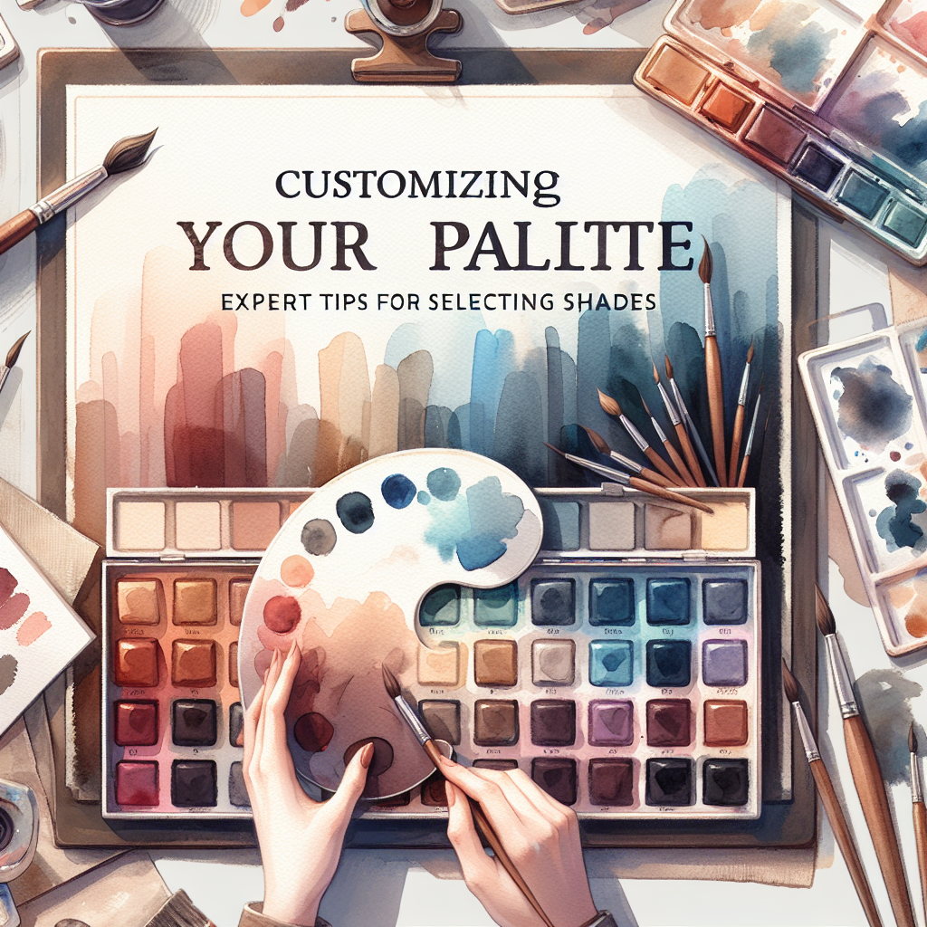
Choosing the right color palette can significantly influence the mood and aesthetic of your project, be it interior design, graphic design, or personal style. With so many options available, it can often feel overwhelming. Below are expert tips to guide you through the process of selecting the perfect shades for your palette.
1. Understand Color Theory
Familiarizing yourself with the basics of color theory is essential. Colors can evoke different emotions and reactions:
- Warm Colors (reds, oranges, yellows): Usually energizing and stimulating.
- Cool Colors (blues, greens, purples): Often calming and relaxing.
- Neutral Colors (grays, browns, whites): Great for balancing out bold colors.
2. Identify Your Purpose
Think about the purpose of your project. Are you designing a website, redecorating a room, or creating a piece of art? Each scenario may call for a different palette:
- Business or Professional: Opt for subdued and professional hues, such as blues or grays.
- Creative Projects: Feel free to experiment with vibrant and unexpected combinations.
3. Use the 60-30-10 Rule
This classic design rule helps create a harmonious balance in your color palette:
- 60%: Dominant color (walls, background)
- 30%: Secondary color (furniture, larger decor items)
- 10%: Accent color (accessories, smaller decorative elements)
4. Draw Inspiration from Nature
Nature offers one of the most beautiful and balanced color palettes. Take a stroll outside, or look at nature photography to find combinations found naturally:
- Mountains and sky: deep blues, earthy greens, and soft whites
- Flowers: vibrant pinks and yellows paired with greens
5. Experiment with Color Swatching
Before committing to a palette, experiment with color swatches. Create a mood board or use digital tools to play with different shades and combinations:
- Physical Swatches: Collect paint chips or fabric samples to visualize the colors in person.
- Digital Tools: Use apps like Adobe Color or Canva to play with shades and understand their interactions.
6. Consider Lighting
Colors can look different under various lighting conditions. Always test your chosen palette in the space where it will be used:
- Natural Light: Colors appear truer during the day.
- Artificial Light: Warm lights can soften colors and make them appear more yellow, while cool lights can enhance blues and greens.
7. Ask for Feedback
Sometimes, a fresh pair of eyes can help you see things differently. Don’t hesitate to seek feedback from friends or colleagues, especially those with a keen sense of design.
8. Trust Your Instincts
Ultimately, your palette should resonate with you. Trust your instincts and choose colors that inspire you and reflect your personality.
Conclusion
Customizing your palette doesn’t have to be daunting. By understanding color theory, identifying your project’s purpose, and experimenting with different shades and combinations, you’ll be well on your way to creating a stunning and cohesive color palette. Remember to have fun with the process and embrace the power of color!

